Brief
MissionDuco’s product roadmap is completely focussed on AI. While many simply bolt on AI to legacy platforms, our mission was to reimagine an AI-first user experience from the ground up and design a framework to support a long roadmap of AI features.
Why
- Maximise adoption of AI features
- Improve user experience overall
- Modernise look and feel
How
- Identify themes in current UX issues
- Analyse AI trends and competitors
- Run AI-first, UX vision workshops
What
- A new AI-first platform framework
- Modernised and branded visual style
- Upgraded, easy to use, design system
RoleAs the only product designer in the company, I led the UX strategy, research and design for this project. I continue to design and test new features based on this framework and work closely with Engineering and Machine Learning teams to streamline the design workflow.
ResultDuco means “I lead” in Latin and UI 3 signals our intent to the industry as leaders in AI-first UX. User feedback has been fantastic as legacy pain points have been swept away, AI adoption has been strong and product demos and marketing blow the competition away.
Research
A radical change in technology requires a radical change in UX
We are experiencing an AI revolution and roles, personas, objectives are all being reinvented. Duco has always believed that user experience is key to success. So what would a future vision of an AI-first experience look like? To find out, I ran a series of UX workshops which generated 176 ideas, all of which was reduced to these key themes.
UX vision
- Minimal – focus on the content, reduce buttons and prioritise AI chat
- Dynamic – personalised UI that adapts to the users role or current task
- Trust – everything evidenced or self-validating, preferring logical rules over black box suggestions
- Visibility – human in the loop on every decision and detailed auditing of AI activity
- Proactive – use several levels of context to provide tailored insights
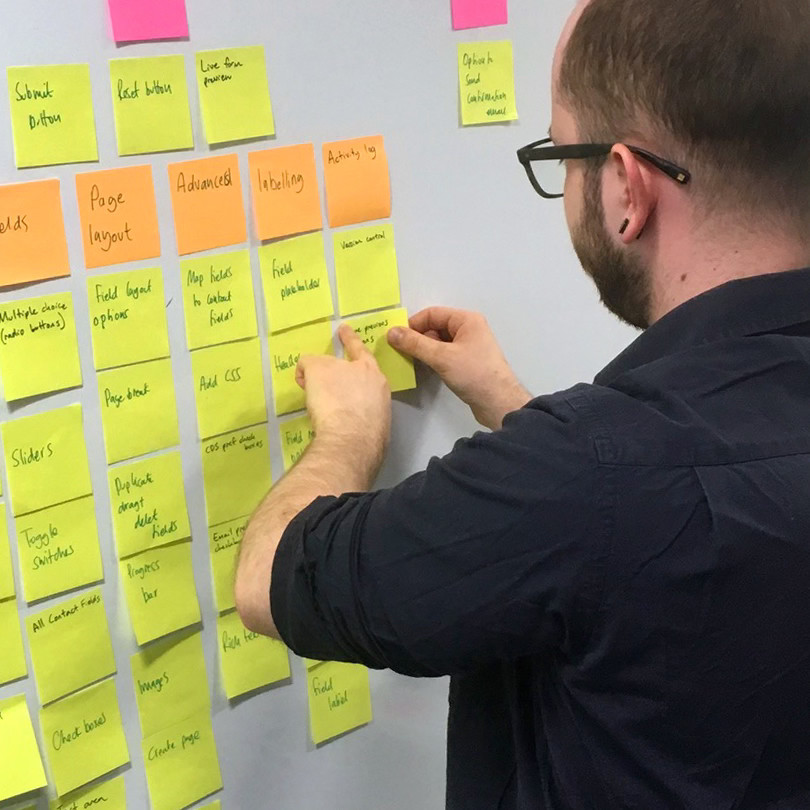
UX Vision workshops ran in multiple offices and countries, generating 176 ideas and sparking inspiration among colleagues
Legacy issues
Part of my research included analysis of the current platform to identify any pain points that I want to solve as part of the UI redesign. Using tools such as Productboard and by talking to relevant groups, I discovered some of the key themes. The cause of these issues comes down to poor communication between teams creating inconsistency and a focus on new releases over fixing old issues.
Existing issues
- Navigation – inconsistency, no clear hierarchy, hard to find the right page or section
- Lack of space – huge amount of wasted screen space due to large headers, menus and drawers
- Actions – lengthy series of clicks to perform common actions
- Views – difficult to narrow down large sets of data and save those views for reuse
- Lack of home – no centralised location to view notifications or monitor processes and tasks
Design
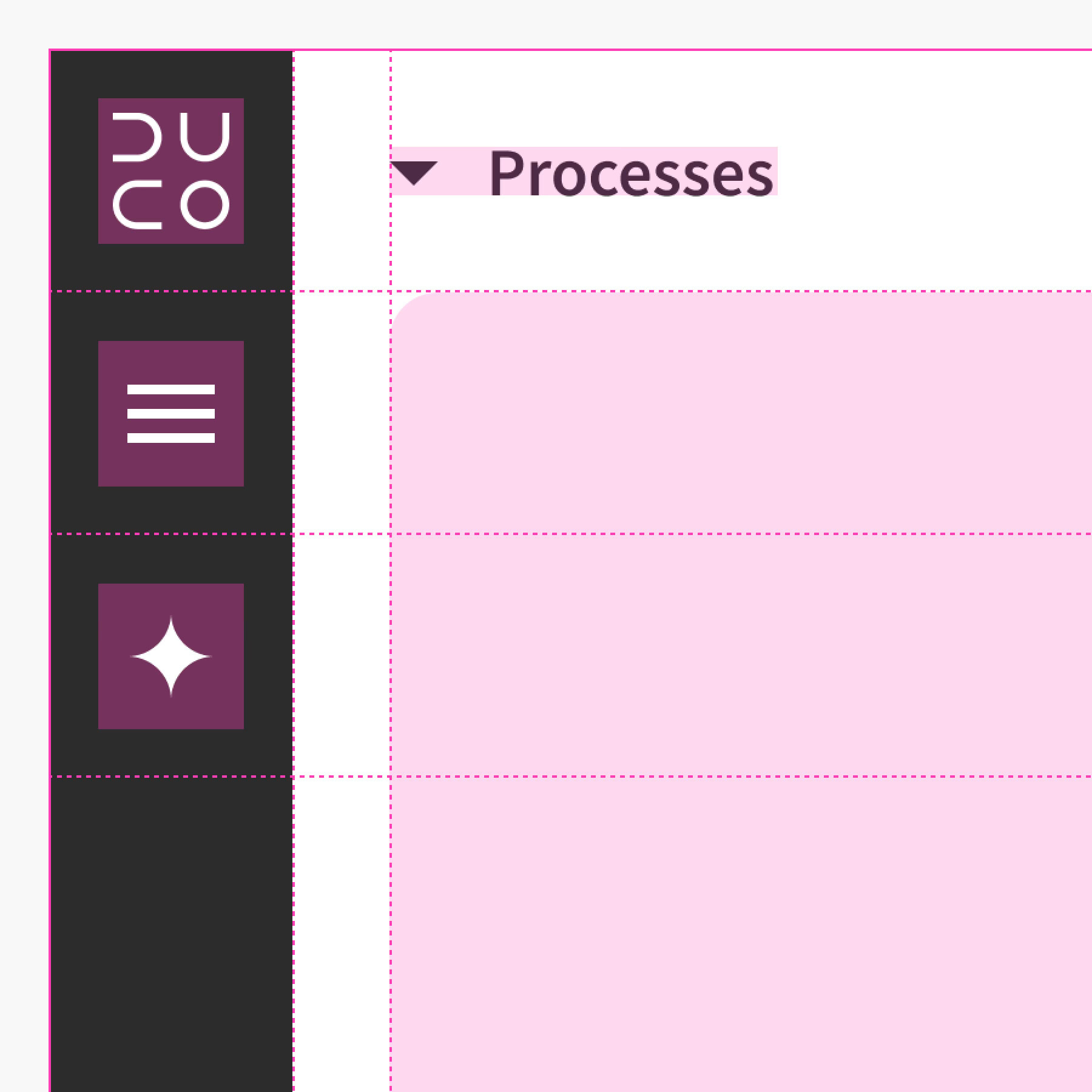
The objective of this project was to create a new UI framework for the platform. It was not to redesign every page or component. The new layout was as minimal as possible – removing clutter so the page content is the focus. Menus and drawers were all reduced or removed. Designing a new basic layout, with a grid and columns, gave the whole platform a balanced, consistent structure.
The new navigation contains a global menu and contextual menu, both work seemlessly with
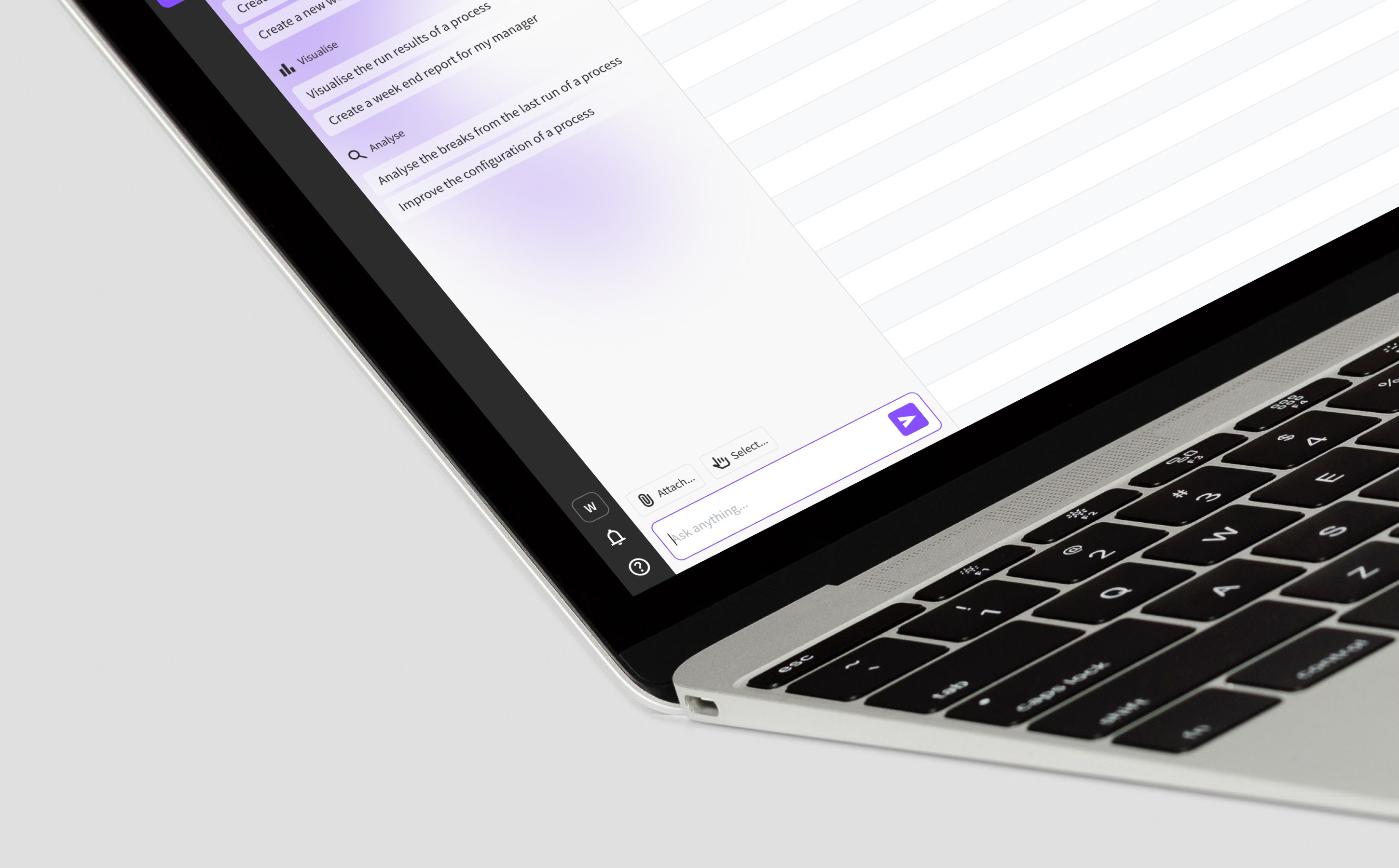
The main menu bar was moved to the left of the page, instead of the top, to maximise height and neatly incorporate the agentic workspace
Design system
Prior to UI 3, the platform was built on a mixture of different component systems. For consistency, I agreed with Engineering that we should use Bootstrap 5 across the whole platform. This was right for us because it’s reliable, well documented and saves a huge amount of time versus creating our own design system. All engineering teams find it easy to maintain consistency with Bootstrap.
Navigation
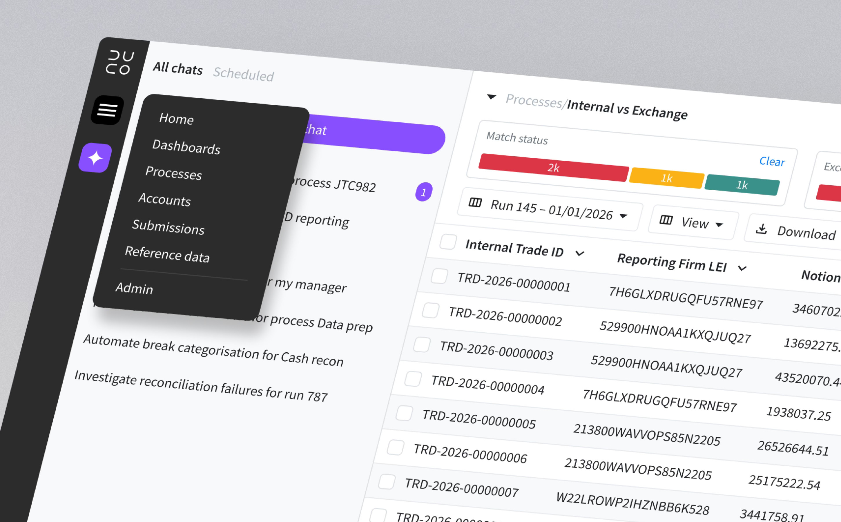
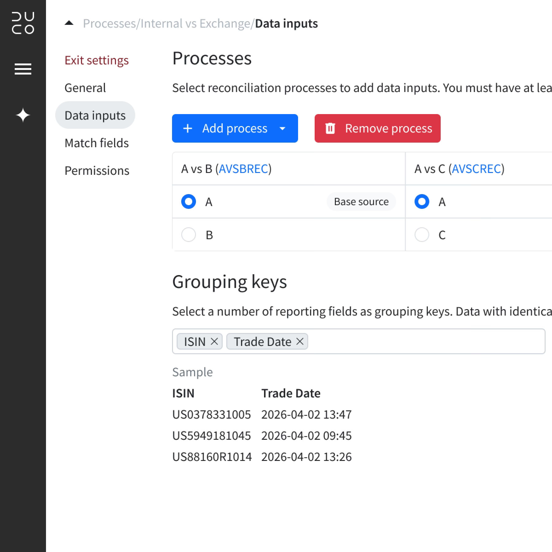
The Duco platform has over 100 pages, split between multiple sections and levels. The biggest change was moving the main menu bar to the left of the page to integrate it with agentic workspace. Removing horizontal header bars created far more space on the page for content such as results grids, dashboards or settings. I created a site map to ensure the new navigation works well on any page and added a breadcrumb component for clear understanding of location.
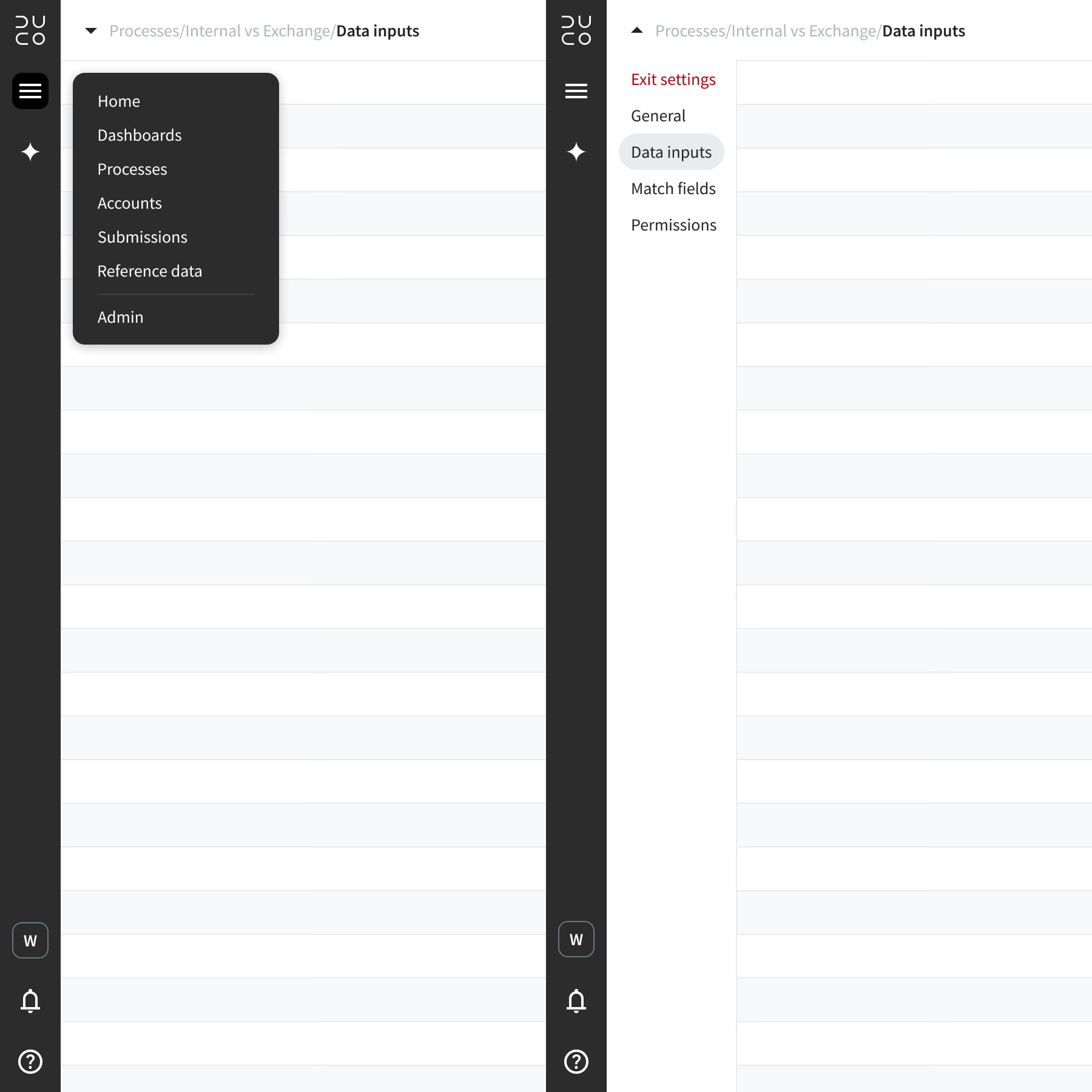
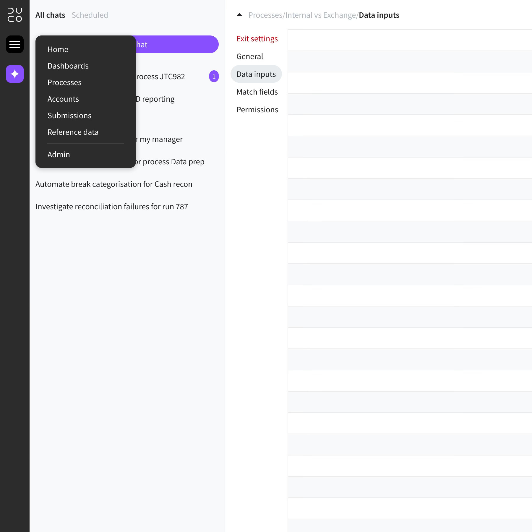
The main menu bar was moved to the left of the page, instead of the top, to maximise height and neatly incorporate the agentic workspace
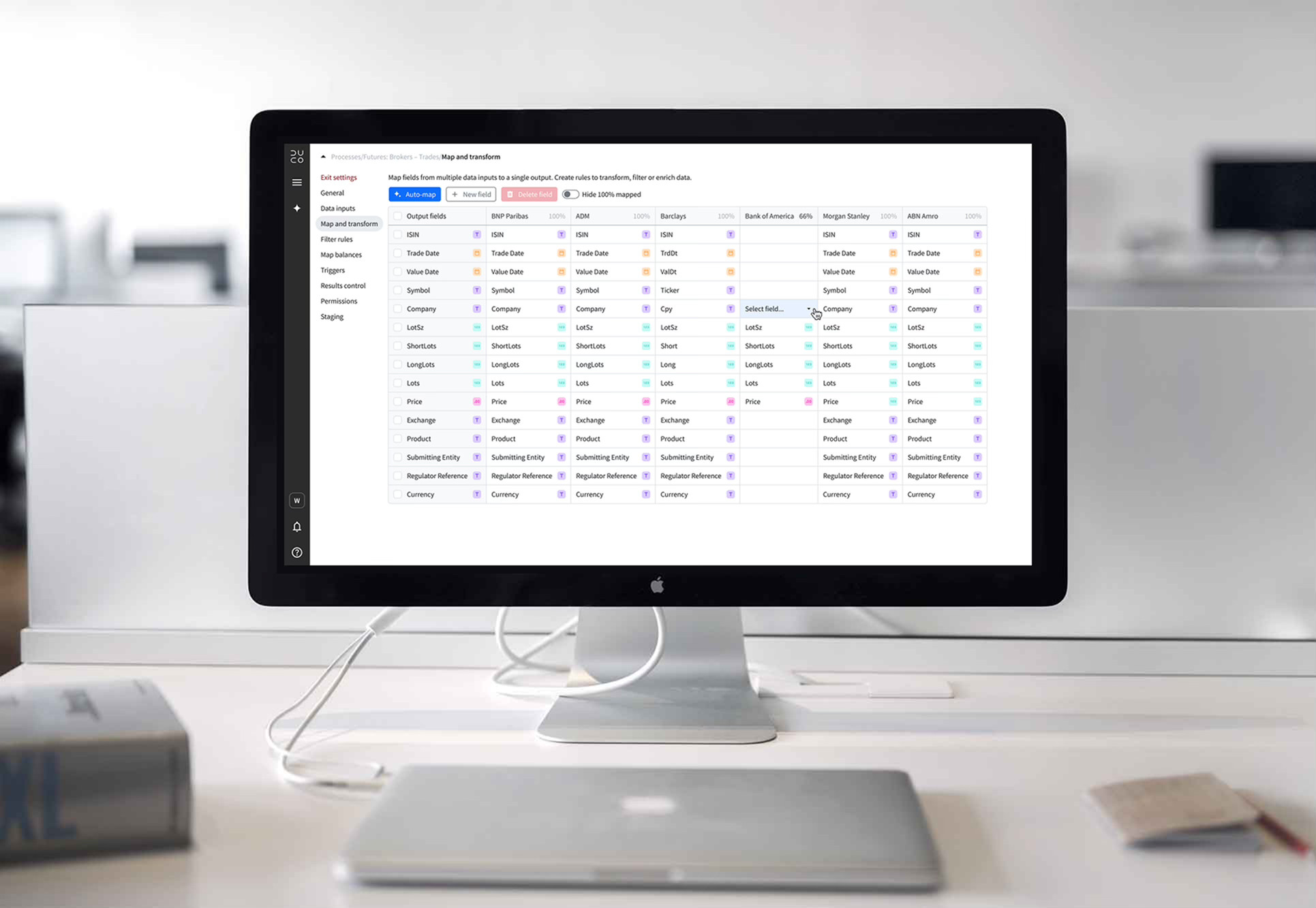
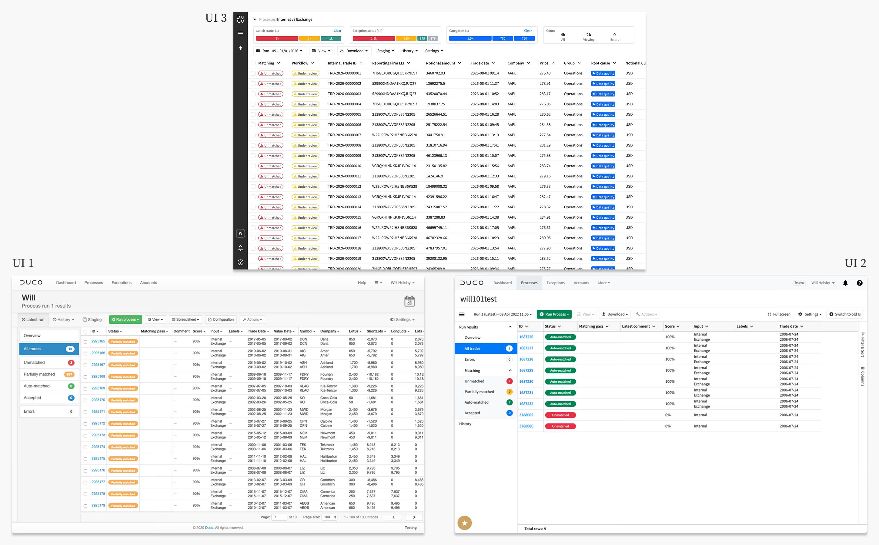
Results pages
Most users spend their time looking at results pages. Processes run every day and each user will be responsible for several of them. They must quickly analyse exceptions, determine the type of issue and assign for further processing, while working with huge data sets. With this user in mind, I redesigned the results page to make their job as easy as possible, eliminating known pain points.
Improvements to results
- Filters – Slim widgets above the grid provide insight on the data as well as quicker, more flexible filtering
- Actions – Responsive layout to replace actions drawer, keyboard shortcuts make actions even faster
- More data – Minimal header and menu increases space for data, especially important for SaaS
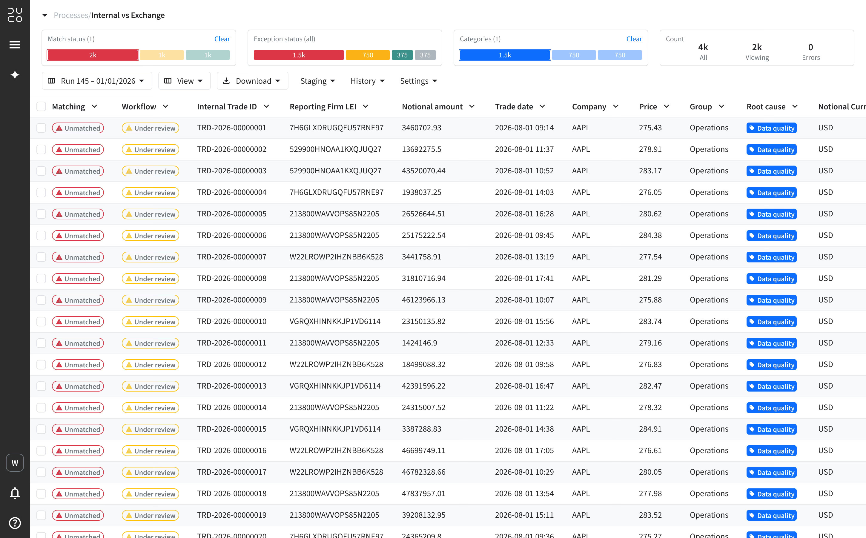
Results pages are the most heavily used pages in the platform, users want to view as much data as possible and interrogate it with ease
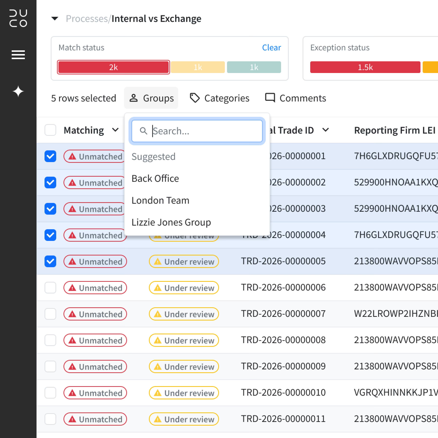
Actions have been redesigned for speed and simplicity
Accessibility
A significant part of the new UI was a full accessibility review using the latest WCAG 2.2 guidelines. This is essential for compliance with accessibility regulations for SaaS products in many regions around the world. After completing an initial audit of every page of the platform using AI powered software, issues were recorded and I worked with engineering to resolve them. When complete, I produced Duco’s first ACR (accessibility conformance report) which is used to unlock sales and mitigate compliance risk.
Review
Why it works
UI 3 created a framework to support an AI-first roadmap by finding a home for a core feature – agentic workspace – and building a minimal, organised interface around it. The menu bar sits on the left side of the screen and integrates with agentic workspace, while reduced headers provide much more screen space. Navigation is much easier and logical and performing daily tasks is far simpler thanks for improved results screens. UI 3 was demoed internally to the whole company and received high praise and is now the default UI for client facing mock ups. Roll-out of the new UI is currently underway.
As the first and only designer at Duco, I have lead the company through two separate UI evolutions since 2019
Looking ahead
UI 3 provides an improved framework for the entire platform. It’s designed to be minimal and support an AI-first user experience. While it achieves these goals, some existing pages still feel clunky and laborious. Even with a new framework, many pages still contain features with a poor user experience due to their age. UI 3 offers a new AI-first approach to tasks users perform every day and all parts of the platform need to be reimagined to support this vision. With the new framework as a solid foundation, this would be a valuable next step.